A one-time trick huh. XD Dogs of the future, of the past... they were pretty interesting! The animation's a bit simple, but I do like the idea and execution of it all. Works well.
-cd-
Couldn't finish this... thing... on time for round 2 of the Newgrounds Animation Summer Jam unfortunately. But hey, it's a something so hopefully someone can get some enjoyment out of this.
EDIT: Nice, a daily 5th place! That's a pleasant surprise.
A one-time trick huh. XD Dogs of the future, of the past... they were pretty interesting! The animation's a bit simple, but I do like the idea and execution of it all. Works well.
-cd-
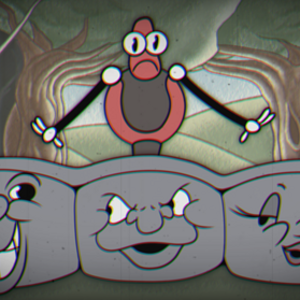
The title card and music were nice. The animation wasn't that good though, and there were some other issues. When the mailbox spits the letter out, we naturally think that's not what was supposed to happen, and this is helped by the Xed out eyes. Also, when the letter is spit out, it's moving to the left, but in the next shot, it's going to the right, though that didn't bother me as much because the first time watching it, I didn't really pick up on what happened, because pf the thing I mentioned before this. The idea that the mailbox spits letters around the world is cool, but could have been communicated better. The sun and moon are pretty cool, the sun clearly being more 1930's than the moon. In the beginning, it wasn't really clear that what he wanted were friends until he ot the idea for the dog. The ending punchline wasn't that great, to be honest, it felt pretty predictable from the moment he said play dead, though I do like the happy face with a tear coming down it. Overall, it had some interesting ideas, but was a bit confusing and not that funny, and didn't really nail the 1930's style in all areas (aside from music and some animate inanimate objects). Also, did you mean you just didn't finish it in time, or you didn't finish it at all?
I agree with you that the scene in which the mailbox spits out the letter has not been executed very well overall. The animation was pretty limited on that and the key frames should have been way more exagerated in. Your comment about the direction of the mail is something I didn't notice myself so thanks for pointing that out. Theme wise, this short is a bit all over the place. It could have been more akin to the 30s rubber hose style animation in some ways. The punchline isn't that great, but that's because of a shortage of time. Cartoons from that era can be pretty corny so It wasn't that much of a problem I think. It was the easiest way of finishing the cartoon. A lot of things could have been better, but it takes a lot of time to do all these things by myself. I'm learning a lot from it though. Thanks for the feedback!