
Something small while I learn to stop procrastinating
Share
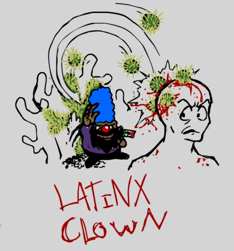 Would like some opinions while I learn to settle for what I want my art to look like, if that makes any sense. just any criticisms if you guys have them. Are the bold-Ish lines like kinda gay or is it alright? Will probably repost this in the newest art dump I'm in the progress of putting together, might also try putting the pen back to something thinner for a bit like it was before because I'm not that confident in the bold lines looking that good honestly. I'll most likely chisel down the lines for when this does eventually get reuploaded in a different post maybe. My pen setting is 2, 51 smoothing, and 300% zoom in flash. So if anyone has any critiques as to what could make this look cooler drop them on me!!! back 2 work children see ya!!
Credits & Info
- Views
- 53
- Faves:
- 1
- Score
- Waiting for 1 more vote
- Uploaded
- May 30, 2025
- 12:22 AM EDT
- Category
- Illustration
You might also enjoy...


Licensing Terms
You may not use this work for any purposes.


