![Kevin [2K23]](https://art.ngfiles.com/thumbnails/3065000/3065198.webp?f1677238319)
I dig this one...admittedly I'm biased, as I like works based on a single color. Very cool--in both meanings of the word. Also the piece is not centered, which is good. Off-center subjects with a balanced element to one side are more interesting.

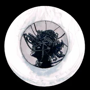
The Colour of Television [2K23]
Share
60th illustration of the year.
Inspired by the first line in William Gibson's Neuromancer: "The sky above the port was the color of television, tuned to a dead channel."
Copic markers, permanent black marker, gel pen, and some lighting/scanline effects in Photoshop and MOSH. I enjoyed doing this one; didn't take long to do. Skinamarink-inspired. Still obsessed with this movie despite the fact I don't really want to see it again. Found it pretty terrifying, actually.
Actual Skinamarink fanart below:
CobaltRogueX responds:
Thanks! I'm glad you like it.
Long live the new flesh
https://www.youtube.com/watch?v=P0XwWXgISXI
CobaltRogueX responds:
I fucking love that movie! Favourite Cronenberg film.
Credits & Info
Plenty more like this here!
You might also enjoy...
![//SKIN_GRAFT\\ [2K24]](https://art.ngfiles.com/thumbnails/3936000/3936027.webp?f1716824656)
![Phantom Astronaut [2K24]](https://art.ngfiles.com/thumbnails/3926000/3926362.webp?f1716367861)
![Burn Victim's Tears [2K24]](https://art.ngfiles.com/thumbnails/3916000/3916374.webp?f1715957144)
![RAN 乱 [2K24]](https://art.ngfiles.com/thumbnails/3912000/3912734.webp?f1715784516)
![Sketchbook Smoker XIX: Bad Hair Day [2K24]](https://art.ngfiles.com/thumbnails/3912000/3912626.webp?f1715778604)
![Sketchbook Smoker XVIII: Gangster [2K24]](https://art.ngfiles.com/thumbnails/3906000/3906945.webp?f1715518917)
![Ms. 45 ACP [2K24]](https://art.ngfiles.com/thumbnails/3873000/3873946.webp?f1714057457)
![MALFUNCTION//METAMORPHOSIS [2K24]](https://art.ngfiles.com/thumbnails/3832000/3832905.webp?f1712227389)
Licensing Terms
You are free to copy, distribute and transmit this work under the following conditions:
- Attribution:
- You must give credit to the artist.
- Noncommercial:
- You may not use this work for commercial purposes.
- No Derivative Works:
- You may not alter, transform, or build upon this work.


