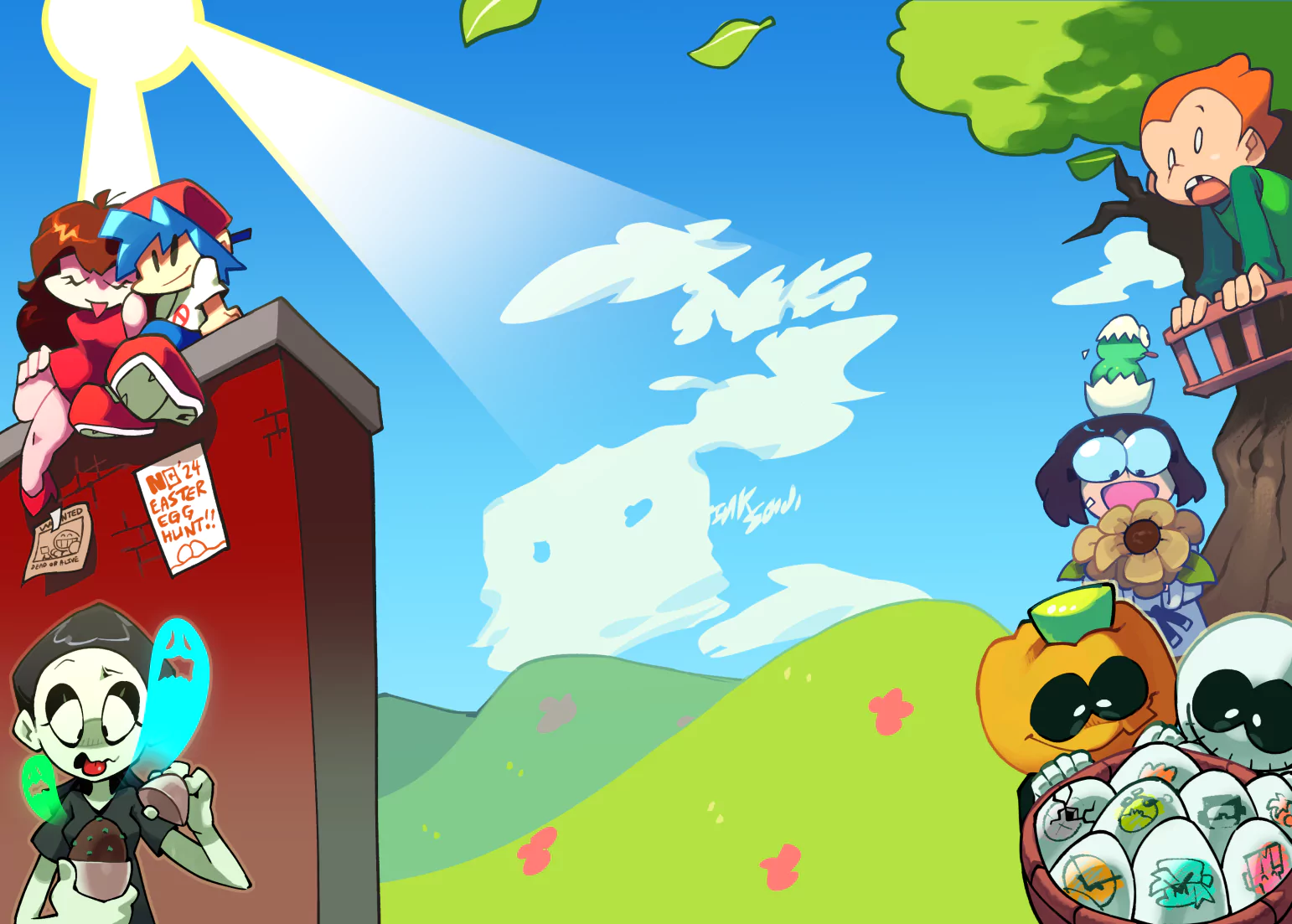
Cute
Looks great! ...I never really know what to type in a review... :l

Cute
Looks great! ...I never really know what to type in a review... :l
I love it!
I love you x
GIRUGAMESH!!!
does the red head remind anyone else of that?. But seriously, it's a nice piece of work, hope to see full characters later on!
Yo! is good.
hey, I just dragged my ass through some big ass dung mound of art and came across this pretty little gem. It's true that your work needs a little polishing but looking at that not much polishing is needed. I'm no pro myself so I can't say much...but, the colors and the background in this picture are very good. The body shape and the facial features of the characters need refining but you're almost there! I say this is pretty well done.
lol can't help but point out that vocaloid isn't really a game, rather a voice synthesis software, a pretty good one at that. I suggest you look for some songs with the character Miku Hatsune in them...like "Melt".
Good luck with your future work!
CHiao!
Thanks for your comment. ^^ It's good to know that what you make isn't just random and crapy stuff. I usually go really hard on myself when I need somthing good to be done. :/ I have to learn to stop doing so.
Heh, well I have already seen some of the vocaloid music videoes, but I still kind a thought it was a game. Seems not. O-O;
Very Close!
Hey there, thanks for commenting on my drawing of Azusa! I'll do my best to help you out. Here we go...
GOOD POINTS:
- Poses are cute and lively.
- Characters have unique designs, even if you were directly influenced by Vocaloid.
- Crown and star motifs are generally well-placed, though I think an arch like this:
(_\ | /_) <--- would be better.
- Colors are bright and vivid to match the tone of the image.
THINGS TO IMPROVE:
- Lineart. Your lines are quite wobbly from up-close. Mine are, too--the trick is to draw it big, like you did, and scale it down to a more manageable size. The lines will clean themselves up.
- It's really hard to incorporate all the colors nicely. It can look mismatched. It's definitely NOT "crappy," though. Just try to limit your color palette and study the color wheel.
- Clutter. I really like the crown and stars, but the green circles and the wing in the background seem out-of-place. Be careful not to mistake clutter for detail.
Overall, this is very cute, fun piece. I definitely get an electric vibe. ^^ Please keep drawing and posting on NG! I'm no expert, but I'd be happy to continue helping you.
Thanks a bunch for the tips! And for the comment to. I've been fearing that I wouldn't be noticed anymore, so I kept on announcing in my comment, thought I think the FAQ said I shouldn't, so I feel bad for doing it. But frustrated as well, becouse nothing happens. :(
That's why keep advetising. But guys like you make my heart cheer up, when you comment tips this good. ^v^