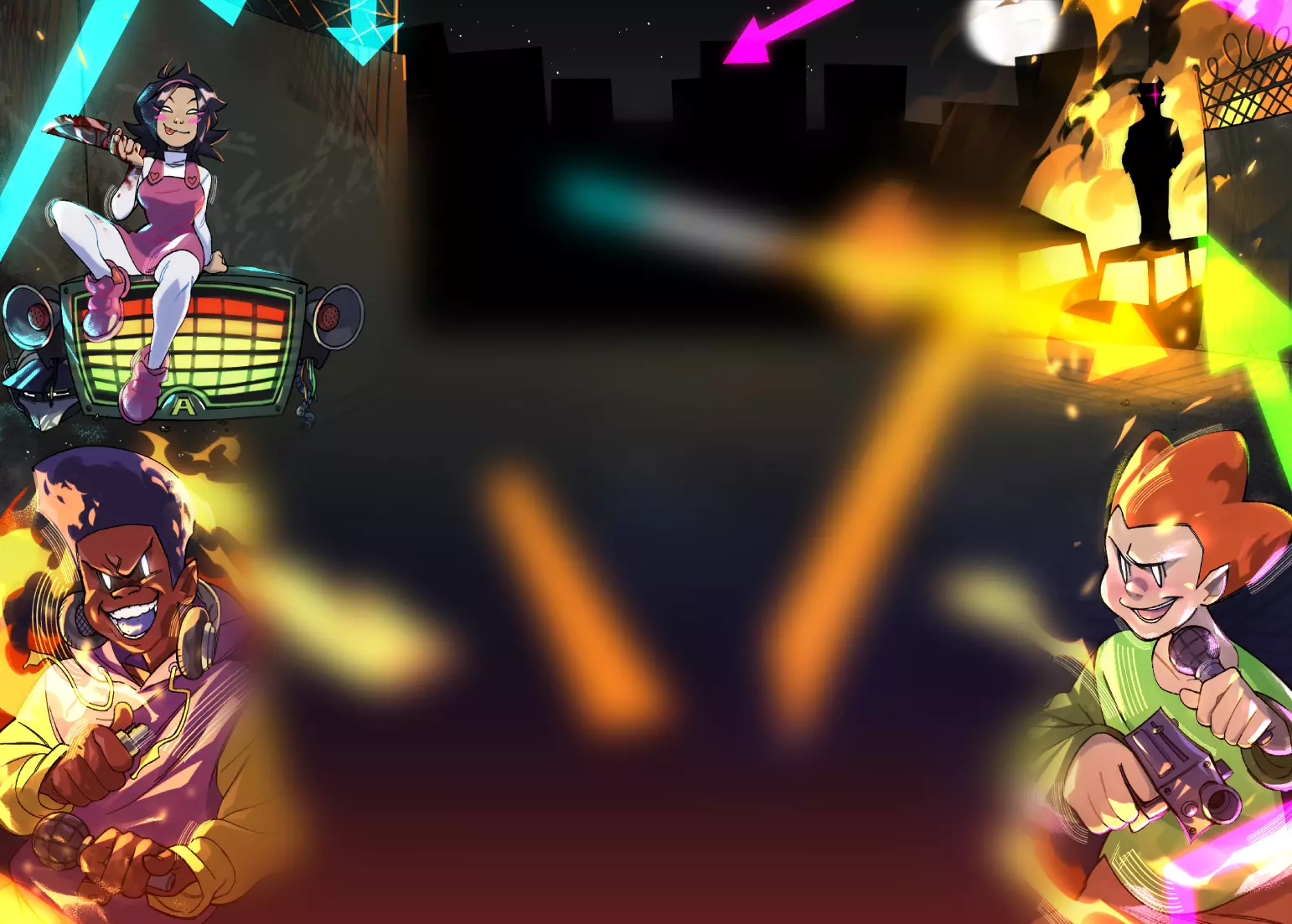
The legs aren't placed a way in which they can be connected on an "eye-pleasing" way, meaning the the structure they're atatched to is the style's projection of a demormed hip.
About the style: The usage of shapes is quite messy. Some places, have sharp edges at the end of a long limb, smoothly outlined in black lines that get thiner or thicker for the purpose of ginving depth... and some other places have what looks like kiddie-cartoon bushes rather than smoke (bottom left, top of the signature).
Good fading at the top left. Curious choice at the bottom, on the bushy smoke... I like it
Also the short big-headed midgets in the back are very different from each other and have sketchy features, not toony ones, sketchy ones.
The fire looks parody-comic-like and the lady "cool edgy". Also, not the breat expert, but her left boob lokks rotated in respect to the other.
The body is chest short, and the legs long, both in a different fashion.
The right hand is too claw-like, and the dakimakura it holds looks too dark at the bottom.
The mouth is imperfect. Nice eye. Cool hat, it suits the body and arm, though maybe it could use some more shadowing on the left..
I like the colours very much, good for a poster of the lady, the explosion isn't that eye-catching.. The hair calls my attention a lot, it stands out, good job if that was intentioned.
I like the light on the back foot too, it suits the ground texture. About this second element, it doesn't seem to match with the lady's bust to me. Just realized the smoke in the space behing her legs is cammo-looking, it looks unfinished to me.
Very nice poster
