Terrible animation.
The background looks terrible and the set looks cheap. Big dog is always changing in very strange ways, consisting of size, shape, and thickness of the character. The plot was lazily thrown together, only making this worse is the fact that there is nothing to really see on the reason for his revenge. Flashbacks can be good, but in some instances it shouldn't be relied on if the entire animation is about that flashback. As well as that, this wins second place for the cringiest movement style (Losing to planet outcast 3056) mainly consisting of slow and choppy animations. As a bonus, classic cartoons are slightly energetic and have some cute ways of breaking physics (ex. arms stretching to empathize reaching and stuff) however, this animation seems to be more bland than a live action movie made by Disney channel. Just no, rework it.
The thing you did right: decent intro. not going to call it a masterpiece though, just better than the entire animation.
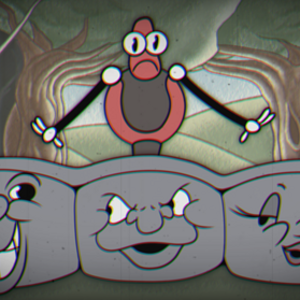
Big Dog's Revenge (1930's Robot Jam)
Here's my entry to the 1930s Robot Animation Jam. It stars Boston Dymanics' "Big Dog".
Ready for a story you've heard a thousand times before? I had so much more planned for this, but I had to cut it short because life got in the way. Even though it isn't perfect, I'm still just happy to have been able to participate in this jam. I love this theme, and the other entries are really awesome.
【#BOTSRIGHTS】
BICYCLE KICK!
Really liking the original take on the theme! The character design and introduction sequence are in line with the 1930's aesthetic, the music is fantastic (I was head bopping to that beat) and the intro had me hooked with how trippy it was!
I think where it could have been a little better was with color choice mostly. I think the introduction's background was good, but the black outlined/white font didn't really fit, I think if it had been all white (or off white) and blurred into the banner a bit more it could have been really authentic. Similar with the rest of the clip, I think some less vibrant colors would have fit the period more, but then that's just my nitpicking.
Overall, enjoyed the sense of humour, art style and music, good work!
Thanks a lot! I appreciate the feedback, and completely agree, although I think the main thing I would have improved if I had time is not colour choice but frame-by-frame animation, Anyway, thank ya <3
Credits & Info
- Views
- 1,134
- Faves:
- 1
- Votes
- 108
- Score
-
3.01 / 5.00
- Uploaded
- Jul 14, 2018
- 10:32 PM EDT
- Genre
- Comedy - Original