00:00
00:00
Newgrounds Background Image Theme

Chan99 just joined the crew!

We need you on the team, too.

Support Newgrounds and get tons of perks for just $2.99!

Create a Free Account and then..

Become a Supporter!

Night in the Rain

Share Collapse

Author Comments

This is the follow-up to Night at the Casino, which is linked to in the preloader.

If you liked this cartoon, please follow me on Newgrounds to be notified when I release a new cartoon: http://mistyentertainment .newgrounds.com/follow

Log in / sign up to vote & review!

Those heartfilled eyes are a bit creepy, showcasing more insanity than love... I feel, but apart from that final scene it's a both short and emotiative piece. The music adds the atmosphere, and the animation is both fluent and logic, without a need for words. Nice work!

-cd-

aww made me hopeful again. Valentine '13 here i come!

The metaphorical rain effect is mindblowing and will revolutionize video as we know it.

MistyE responds:

~~~

I must saw the music was really addicting, how ever if there was a little more spacing between purple being a bitch and yellow (or at least thats what i thought that was keep in mind that I am color blind) this movie would've been a perfect colorful romance

MistyE responds:

Thank you! I have a big cartoon coming up, so stay tuned!

WARNING! LONG AND DEEP REVIEW THAT WILL SYSTEMATICALLY HELP IMPROVE YOUR WORK:

Ok. lets start with the most obvious and annoying downside, the animation is dull. There is like no actual animation whats-so-ever. Its just 1 drawing thats tweened heavily. Perhaps next time you could at least apply some frame by frame animation to give more sense to the movement. The only actual movement that i could identify were the eyes when they blink which isn't enough if you want to make a quality cartoon.

Another problem is the subject matter it's self. Why would you make a music video to an unknown song and how did you find the motivation to do it? The plot is both cliche and boring, you need to spread out the main points more and add important detail.

Also the backgrounds were badly drawn. They had all the important detail however the lines were way too thick. I suggest that next time when you draw straight lines for buildings or something, use the line tool, don't use the brush tool. Furthermore, the backgrounds need at least some depth. Try putting some shadows or blurs.

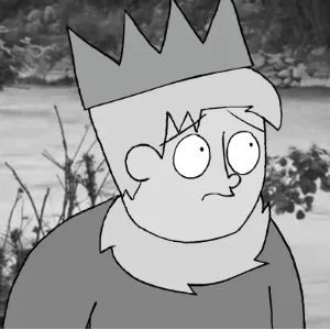
Despite some problems, I actually liked the character design. I know its just plain blobs with eyes but there is something about your art style that made them believable.

This cartoon isn't horrible. I don't know whether this was meant to be a quick test or an actual effort worthy toon but just remember that there is a ton of space for improvement. I hope to see more quality cartoons from you in the future. Just take your time and try your best.

MistyE responds:

Thank you for the long and detalied review. This was meant to be a test to see the best thing I could come up with in two hours. My next cartoon will be a lot better.

Credits & Info

Views
5,675
Faves:
5
Votes
11
Score
4.15 / 5.00

Uploaded
Jan 12, 2013
4:58 PM EST
Genre
Music Video
  • Daily 3rd Place January 14, 2013