Hah, awesome!
This is even better at home. XD Great job and again, you are very talented. ^^

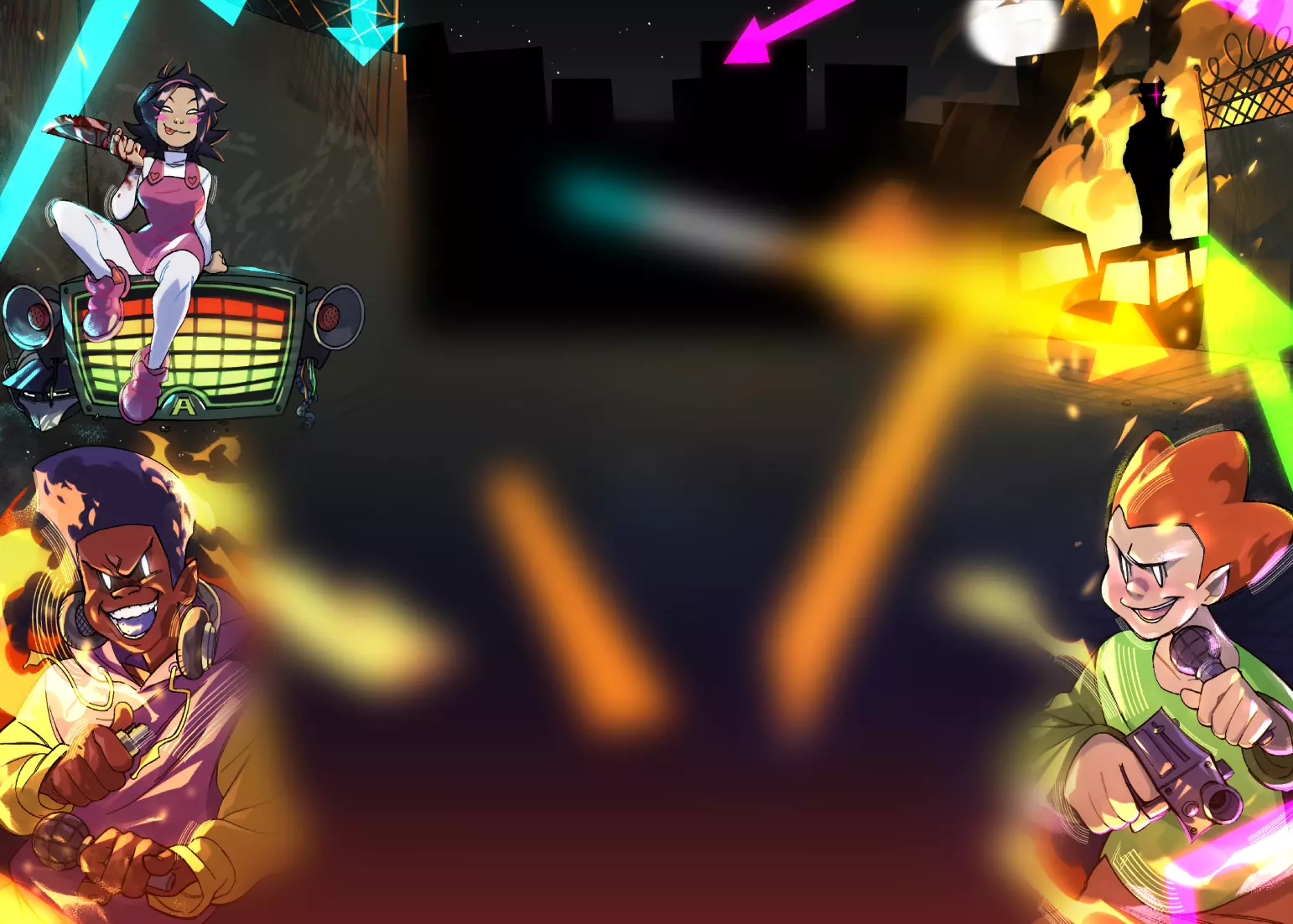
Yes! Finally my entry for the Reflections Art Competition, I'll be submitting it on Nov, 17.
I spend about 10-15 hours on this. Also, well, I won't be able to submit the piece unless I have someone convert it to a movie file instead of a swf, so could someone tell me if they can do that? (High quality please).
PS Has anyone figured out that the black dot are drag-able?
Hah, awesome!
This is even better at home. XD Great job and again, you are very talented. ^^
Good loading bar
First thing I noticed was of course the loading bar. I liked that it followed the mouse pointer. It added some kind of interactivity to the loading screen and thus made the wait more worth while. :)
The main menu could use some more work. The buttons where only clickable on the text, not on the spaces in between the letters. This makes the buttons somewhat harder to click.
The actual flash was very nice and you managed to synch your animations with the music very well.
I liked the dragable black dots. They added some individuality to the flash, because I can drag them whereever I want to. So sometimes they fit very well to a scene and thus makeing me experience a different scene than I would experience if I left the dots completly alone.
The buttons for "part 1" and "part 2" are a very nice idea, but they are too big for my likeing. The take up very much space on the bottom of the screen, obscuring some parts of the animations.
Also, the "Go to part 1"-button brought me back to the main menu, was that intentional?
{ Review Request Club }
Well...
Not a bad piece, though I would suggest that you do something along the lines of adding some colour to the proceedings - without that, there is a certain blandness of the proceedings, which could use ironing out.
I'd also like to see a menu feature in the flash - taking up so much space with links to parts 1 and 2 is never good, as it cuts down on the amount of canvas you can work with for the main part of the flash, which is the flash itself.
It's good work, but a few tweaks either way could certainly help matters.
[Review Request Club]
Not bad.
Nice interactive loading bar you had here. It gets away from the normal loading bar and adds some originality to your submission. Perhaps something like a little mini game with the loading bar would be pretty cool. =P
Perhaps add some background music to the rejected scenes so they aren't as plain as they were.
You had a nice black and white theme to this flash and you timed the colors coming in pretty good. As soon as I thought it was just going to be black and white you threw colors in to mix it up. I liked the gif style buttons. It gave them a nice effect and they looked pretty cool.
Like a lot of your submissions the audio was nicely selected and you did a great job syncing the audio up to look good with the animation.
Pretty good all around.
I love you.
Let's reproduce.
GOOD STUFF, DAG.