00:00
00:00
Newgrounds Background Image Theme

kangeroodude just joined the crew!

We need you on the team, too.

Support Newgrounds and get tons of perks for just $2.99!

Create a Free Account and then..

Become a Supporter!

Needing some feedback

140 Views | 7 Replies
New Topic Respond to this Topic

Needing some feedback 2023-11-27 02:34:34


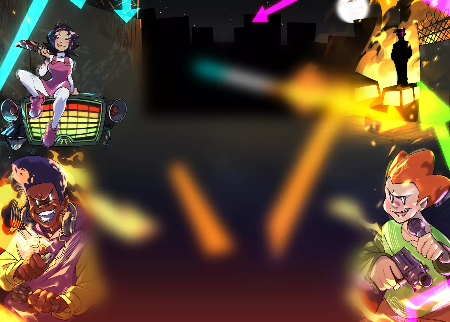
So, this one piece was a bit of a doozy for me. On one hand, I'm happy with the end result, given I don't draw backgrounds and scenes, but given this is my first illustration where it's like a full scene, I wanna know perhaps what I did good with it, some things that could be fixed, and maybe some advice for future art like this.


iu_1121306_8020662.webp


Also, I tried using, generally, more than one shading color, as I usually use only one shading and highlight color in this sort of style for characters, another new thing I did

Response to Needing some feedback 2023-11-27 05:12:07 (edited 2023-11-27 05:12:15)


It's certainly got lots of detail, and you've definitely set the scene. The background's really interesting without taking too much from the characters. Also I like how you use certain blur effects, particularly in the foreground to make the characters the focus. I'm not sure if the purple-blue dragon thing in the background needs blurring, or if all of the background elements need different levels of blurring for consistency. You've also got some good shading going on with your use of multiple colours.

Response to Needing some feedback 2023-11-27 05:45:15 (edited 2023-11-27 05:45:33)


first of all, good job for challenging yourself with a full scene. i can see that you are experimenting with soft edges too.

i like that you blur the foreground statue, making it out of focus thus adding depth to the image. i do like the bluish secondary light you painted on the clothes to better define the form. i think its a good attempt at the shadows having it less sharp as it stretches.


all the good points i mention brings me to my first criticism, lack of consistency. why is it you blur the foreground and some background elements but not the sky and clouds? why only the clothes get the secondary light source? why is it only the character's shadow that gets less sharp as it stretches?


second criticism would be perspective. lines should converge to a point in the horizon but the edge on the ledges of the fence converge towards the viewer. you are shading the fence poles as thou it is cylindrical but you are drawing it flat. the boys hands and feets are humongous compared to the girls, considering he is further away form the viewer.


lastly i am not sure what u are depicting in the background. it looks like theres a dragon and a tower but i dno whats the grey stuff behind the houses supposed to represent. i can see alot of bluish lighter colors, is that an attempt at atmospheric perspective?
Response to Needing some feedback 2023-11-27 07:44:59


At 11/27/23 02:34 AM, MonoArtist wrote: So, this one piece was a bit of a doozy for me. On one hand, I'm happy with the end result, given I don't draw backgrounds and scenes, but given this is my first illustration where it's like a full scene, I wanna know perhaps what I did good with it, some things that could be fixed, and maybe some advice for future art like this.

Also, I tried using, generally, more than one shading color, as I usually use only one shading and highlight color in this sort of style for characters, another new thing I did


The main thing for me is that you don't seem to have a strong grasp of perspective. It shows most clearly in the fence.


The first thing I would do is to put in a horizon line at the height of the characters eyes. This will put the viewer at the same height. That is generally a good way to build a background that the characters fit in.


For the fence, a one-point perspective will be good. That brings us here;


iu_1121353_8016576.png


Note how the opening in the foundation for the fence tilts the opposite way from what you did.


Adding the other elements in (now without much detail) ...and a bit of shadow,

hopefully this gives the feeling of the characters being inside a scene with three dimensions to it.

iu_1121354_8016576.png


I hope this can give you some ideas on things to work on. 🙂


See my profile page for link to showroom

BBS Signature

Response to Needing some feedback 2023-11-27 14:07:06


Hey, thanks for the critique! I'll keep in mind using perspective points in future works (as in this one, I just kinda didn't use a perspective point)


At 11/27/23 07:44 AM, PerKGrok wrote:
At 11/27/23 02:34 AM, MonoArtist wrote: So, this one piece was a bit of a doozy for me. On one hand, I'm happy with the end result, given I don't draw backgrounds and scenes, but given this is my first illustration where it's like a full scene, I wanna know perhaps what I did good with it, some things that could be fixed, and maybe some advice for future art like this.

Also, I tried using, generally, more than one shading color, as I usually use only one shading and highlight color in this sort of style for characters, another new thing I did
The main thing for me is that you don't seem to have a strong grasp of perspective. It shows most clearly in the fence.

The first thing I would do is to put in a horizon line at the height of the characters eyes. This will put the viewer at the same height. That is generally a good way to build a background that the characters fit in.

For the fence, a one-point perspective will be good. That brings us here;

Note how the opening in the foundation for the fence tilts the opposite way from what you did.

Adding the other elements in (now without much detail) ...and a bit of shadow,
hopefully this gives the feeling of the characters being inside a scene with three dimensions to it.

I hope this can give you some ideas on things to work on. 🙂


Response to Needing some feedback 2023-11-27 15:36:11


Seeing others already criticized the bg, I wanna talk about the little guys. The pic is good overall, but they look a bit like they're just copy pasted over, annd i'll explain you why.


Strokes

The borders and stroking of the guys doesn't match the general stroking style you used in the pic, which creates discoungrency. Also, the pixelated stroke makes it look like they were rescaled.


Illumination

The guys have a blue shadow on their sides. It mostly looks like lightning, which in the image environment comes outta nowhere. That kind of details make an art appear like a photoshop, which obviously isn't very encouraging for an artist


Being 100% alive means taking a 50% of actions and having a 50% of perspective

BBS Signature

Response to Needing some feedback 2023-11-27 16:09:34


The biggest thing I notice is the light source appears to be from the front left. In which case the ground shadows are pointing the wrong way based on how the characters are lit. I don't think it looks bad though, it's just an inconsistency to keep in mind for the future.

Response to Needing some feedback 2023-11-27 17:12:51


Thanks for pointing that out!! I actually didn't notice I made that mistake until you just now pointed it out


At 11/27/23 04:09 PM, SeijiArt wrote: The biggest thing I notice is the light source appears to be from the front left. In which case the ground shadows are pointing the wrong way based on how the characters are lit. I don't think it looks bad though, it's just an inconsistency to keep in mind for the future.