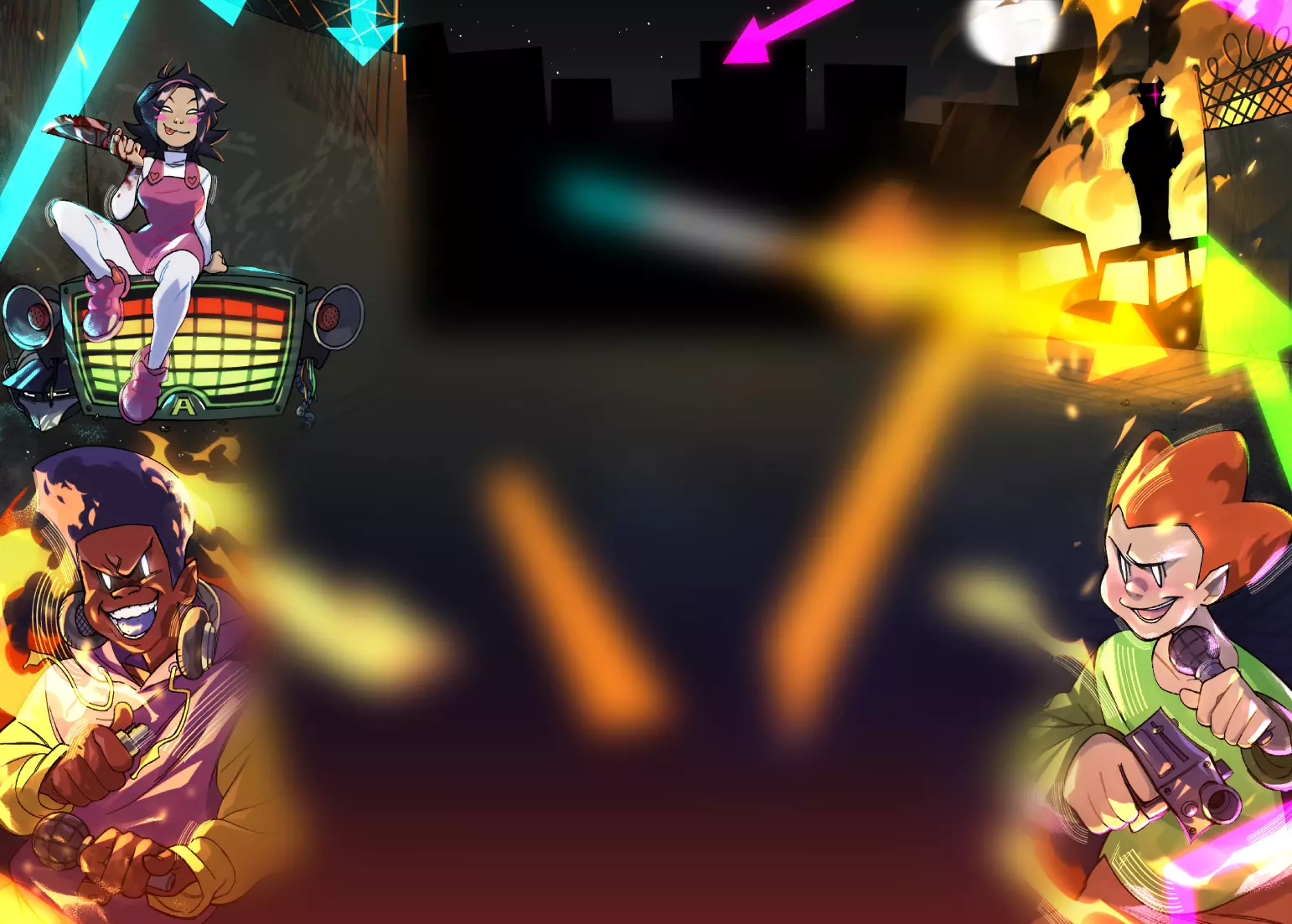
I really appreciate that you're trying to branch out a little more with your style! I will admit that your last few pieces before this had felt very similar. Even though that might have been the intent I feel like it started to have a negative impact after a while. Don't get me wrong though they were all extremely cool, just felt a little samey you know?
Anyway I do have some feedback for this one, but take my feedback with a grain of salt since I'm not super informed on how art actually works and the theory behind it and such.
If you don't wanna take my feedback at all then feel free to completely ignore this, especially if the things I touch on in this are things you were completely aware of
I very much appreciate the amount of detail that went into all of the gray sections of the piece, especially the memories and the skull! Although I can't help but feel like all the gray sections blend into each other a little bit since it all feels so close to the same shade. This isn't necessarily that bad of course, but it's just a tiny nitpick. Especially since it was really easy to tell where certain things started and others ended in your previous artworks
Granted that was because you used more colors but I feel like you still had plenty of grays to choose from to avoid that in this piece
However my biggest issue is that it seems like it doesn't stick to one style, what I mean is it just feels kinda incoherent because each section feels like it would be from its own artwork style.
I think this because:
The colored background looks very smooth and blurry, the character at the top is very rough, the characters on the left look clean and sharp, and finally the skull looks very realistic
I don't know if this is perfectly fine to do in an art piece, but it does leave it feeling unbalanced to me.
I feel like pieces you make in the future in this style may benefit from:
1. Using more different shades of grays in like empty areas or something, not filling in those areas with something new but just to break up the big areas of the same color
2. Using the same style throughout, so that it could be more coherent and cohesive
Overall though, despite these issues that I see in this the concept is still very unique and the actual art itself and the ideas you use in it are VERY cool!
I hope this was useful :)
Update: just noticed that you made changes to this, this looks fantastic now! It feels way more unified!


![[CAPSULES Fanart] [CAPSULES Fanart]](https://art.ngfiles.com/thumbnails/3913000/3913114.webp?f1715797979)
![[COMMISSION] NameNotFoundGER [COMMISSION] NameNotFoundGER](https://art.ngfiles.com/thumbnails/3913000/3913206.webp?f1715801239)