WOOHOO
well drawn, hawt, and original

WOOHOO
well drawn, hawt, and original
awesome.
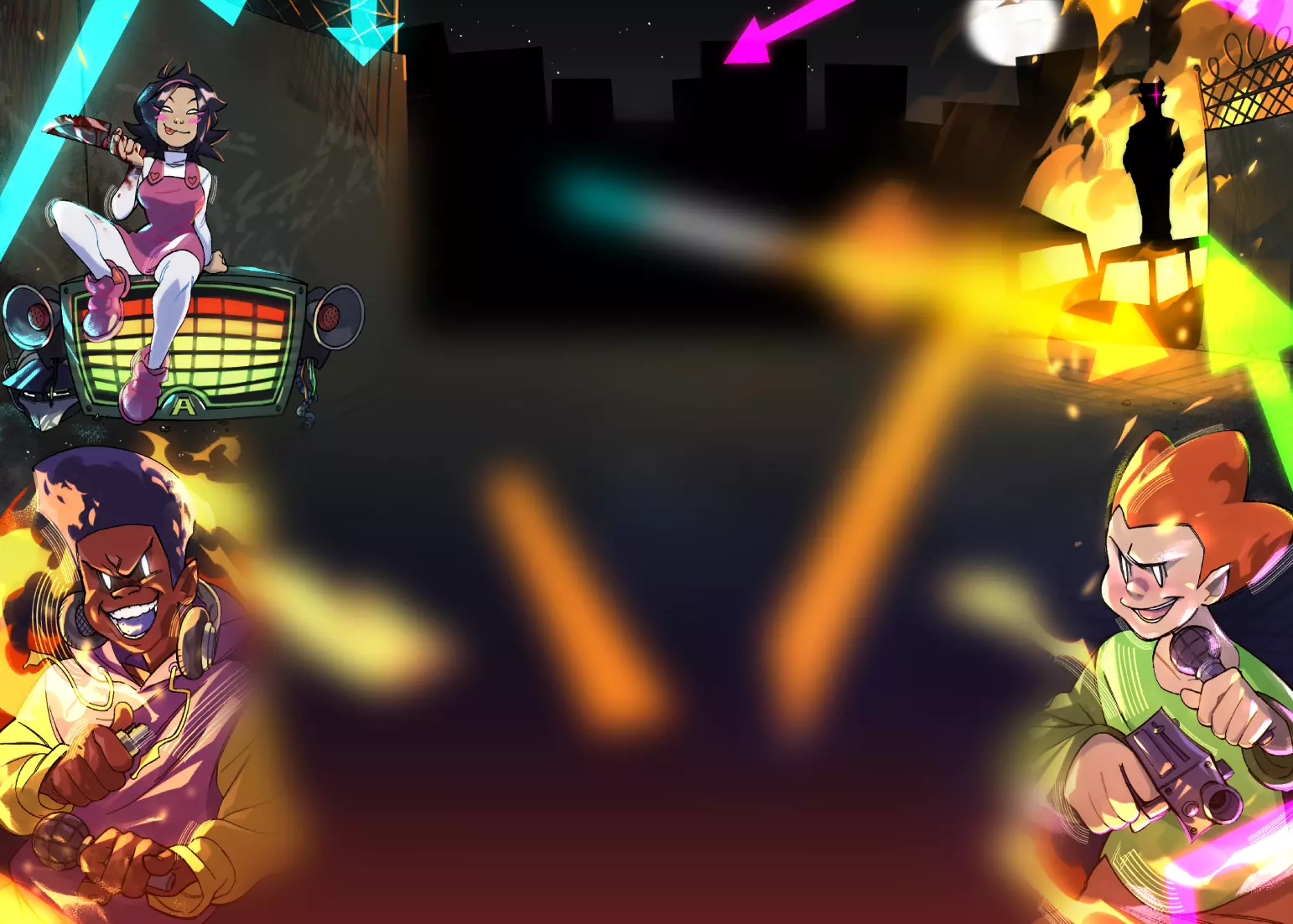
its a great backround that complements the women.
i was wondering do you take commissions?
i love your style and i would gladly pay you to draw my newgrounds avatar!
l8s
What do write, what to write...
Argh! I'll just give away stars, then... >_<
8 Stars: Cus it's a kick-ass kinda... spoof(I think that's the word I'm looking for)!
I know you've heard this alot of times(and I'm sure you wanna hear it more ;))
(You'd probably call me a flatterer, or maybe hug me, but)
Great work! You are indeed 1 of the best.... artist? on Newgrounds.
As stated MANY times before: Keep up the good work!
--SpikeEye
Cute
Ok so this one here, well this one is okay and cute, but a bit much in terms of the text and overall look. I do like this one, and your artistic ability is great, but I feel like a bit of editing was needed here and you could have done away with a few things, but even if you did not do away with them, it is still a fine piece of entertainment and interesting that you did your own take on a staff information card.I like the newgrounds coloring you picked out and how the text and fonts all align with the site fonts and styles. I like that you put your own personality into your character of yourself. The tablet on the arm with the pen was a good touch, almost like someone who is ready for an art battle with gear on her like a gundam or mech. The red shirt was nice and how you added that NG on the collar area was a good little hidden gem to make you show your NG apprechiate and fit the theme of what you were creating here. Even the pants have this part going on and I do really like that. The style is ok but I am not sure where this is based off of anymore, because the URL you provided is gone. In my old age, it is hard to rmemeber the old site stuff all the time, but you did capture something very NG. Now in terms of changes that I discussed when I started my review here, I think you just needed to fix the portion of the head cover the text slightly as it blocks far too much to read and that is fine, but I feel you could have lowered the amount of text blocking by a few words or letters here. I also think that you could have added a bit more textures to your main girl as there is a lot of textures going on in the background and a lot of vectors and she seems a bit too clean for that kind of setting. I do like this and find it very cute and would hope they bring back the staff page soon.
~~THINGS TO IMPROVE ON~~
I would do as discussed above, just change up the amount of the text that is covered up by her head but it is fine otherwise.
~X~