This is quite a clever concept, although I don't think it fits the comedy category very well. The idea of him shaving his moustache being "worse than death" may be amusing, but I feel as if there could have been more done with this to make it more a comedic film, if that is what you were going for.
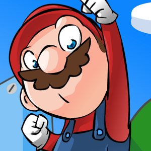
Mario's Sad Day
Mario suffers a fate worse than death for him.
Support me through patreon, merch, or just video traffic through http://octochan.weebly.com/ :)
Main theme: https://www.youtube.com/watch?v=gsG-9k_IjzI
The end theme is in da credits and info section ;D
AdamKrug responds:
I agree with you there. I'm still trying my best to develop my comedic and story skills, as I feel that's one of my bigger weak points for me.
Hmm kinda dark ending there! I like the idea, but if you're going for comedy I'm sure there could've been more comical ways to end this! People no longer recognizing him. People saying stuff about his missing mustache. Something... fun. Instead, he crawls to a door, goes to the office, and visits a shop...? Am I missing something there? Unless this is meant to be abstract, there's plenty o potential there to add some meaningful scenes init. Keep it going!
-cd-
AdamKrug responds:
lol yeah, it was a pretty abstract film open for interpretation; I made the scenes of him walking to the door, in and office, at a store, and at home just to show and express sadness towards the end by showing short scenes of Mario's day.
And thanks for the tips! I'll make sure to take them into consideration for my next project!
Not bad i must say
i bet he regrets for shaving. kinda sad but not that depressing. i did like this movie nonetheless. good job making this movie though. Peace
Food123
AdamKrug responds:
Awww, thanks! You sir, just made my day :D
Huh.....
Well at least the art style is unique
AdamKrug responds:
Yeah... Oh well :/ at least people like the art
The more content you watch on the internet, the more you'll know that the idea of a Mario parody where Mario's life is all gritty and REAL and DEPRESSING is a WILDLY overdone concept. Watch the first episode of HotDiggedyDemon's Wacky Game Jokez 4 Kidz. In general, with video game parodies, you have to think outside the box at this point or else you'll be making a story that's been done a million times. Obviously people are bound to repeat stories other people have already done every once in a while, but sad Mario is a concept that's done so much that it's something people shouldn't bother with anymore.
Your drawings are pretty good, though! The drawings and texture overlays looked good. Good job on that stuff. The lines were pretty good. You obviously have a pretty decent grasp on good looking line widths and generally keeping the outlines looking aesthetically pleasing for the style that you were going for.
The animation could use a bit of improvement. There's a way to do motion tweens and there's a way to not do motion tweens (look up Andrew Kepple/TMST if you wanna see some really good tween based animation). Like, obviously the part at 0:49 had to be tweened and that kinda stuff's fine, but the part at 1:05 looked kinda bad. It just looks lazy when you're just flipping the image horizontally and adding a little bit of bounce to the tween. It would've looked better if you put the effort into actually using another drawing instead of flipping it.
Also, something that I'm seeing a lot of people do is the "full screen face closeup" thing, like, at 0:39. It looks amateur and kinda lazy and sorta over-used at this point. You might as well just do a normal close up where you draw the entire head out. If you want to create a more intense shot, blur the background and zoom in. Basically, there are better ways to convey a close up with intense feeling.
The frame-by-frame in the first shot was pretty good. One could say it could use more inbetweens, but really it was something that could work on fours or however many frames you held some of the frames for.
I always love darker styled stuff. Like, David Firth's stuff and all that. You have what it takes to make a really cool dark animation, it's just that the idea behind this one was kinda whatever.
Oh, also the sound effect of like, a cinder block being dragged across concrete (or whatever that was, I don't know) was pretty funny at 0:49. IMO weird, almost out of place sound effects are always pretty funny. I liked it and I think it fit well as far as tying to make the audience laugh.
Also sorry about any reviews you'll get that suck. Newgrounds reviewers suck 90% of the time. Just ignore anything that isn't obvious constructive criticism. That's not to say that you won't find good criticism that's formatted like crappy criticism. The review before me could be implying that the dialogue or portrayal didn't carry out as well as you might've hoped. JUST BE SMART ABOUT IT because you kinda have to on here.
AdamKrug responds:
Thanks mate; I'll make sure to take what you said into consideration for my next animation
Credits & Info

-
Daily 3rd Place October 12, 2015