Love this
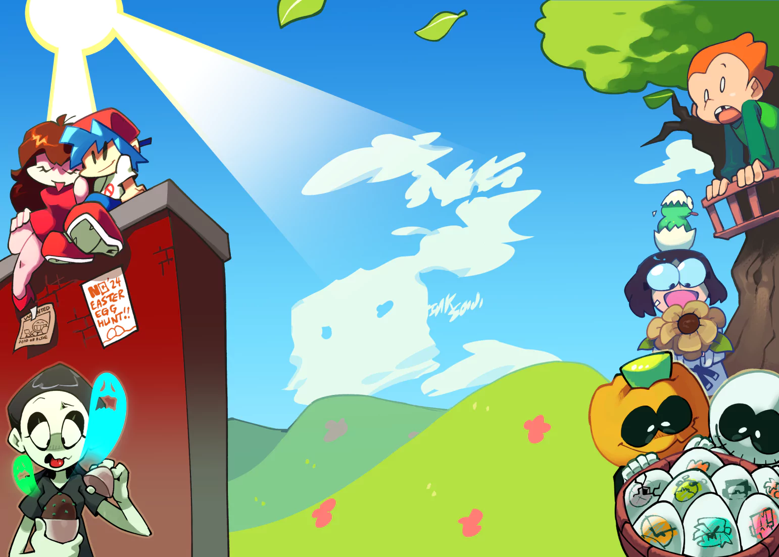
While this was simple and soft I love the whole soft feel and soft colors it's a very smooth piece with very rounded touch even the sunlight was a nice touch not doing too much but still offering some very good light in a low setting anyways really nice work would love to see some fruit from the tree maybe even falling like apples and such some nice detail like that goes a long ways
~~THINGS TO IMPROVE ON~~
Adding small detail is always a plus
~X~

Seaside Sunrise (Colored)
ShareSimple
The colors are very soft, giving it a very attractive appeal for me, and like Haggard, I'm also liking the sun.
The colors lack a definitive outline, and they tend to almost look as though they're blurring together. Very nice work there.
The whole work itself is easy on the eyes, and above all, vibrant.
-Review request Club-
Basic
For my liking, this piece is just a little too basic - there is not enough detail in the artwork for it to really catch my eye, as I prefer something that's going to jump out of the page and scream that the artist has really put some long hours into this to create. Sadly, this one has a very quick and simple feeling about it.
The shading requires more work - there would be some sort of halo effect around the right hand edges of the tree canopy,a s the sunlight reflecting off the leaves would give a scatter, which would immediately improve the detail for the better. Perhaps making the piece a little bigger would also assist, as with a slightly bigger canvas to work with, you can find more inspiration for additional detail?
[Review Request Club]
Nice
The colors are very nice and I especially like the coloring of the sun here.
The shapes and curves are nicely done, too. No sharp edges here, which gives the picture a very nice and relaxing look.
However, I don't like the blurring, I think it disturbs the otherwise nice picture too much.
{ Review Request Club }
Nicely done
I like how you've only used circular and curved shapes, it pulls it together and complements the blurs/glows, which I like as well.
I love the use of light and gradients. I'm not too keen on the use of green. I feel that it contrasts too much with the other colours.
There is something missing here. I think you need to have something to focus on. It's too much just like a background.
[Review Request Club]
Credits & Info
Licensing Terms
You are free to copy, distribute and transmit this work under the following conditions:
- Attribution:
- You must give credit to the artist.
* Please consider sharing revenue!


![[Hades II] Hecate [Hades II] Hecate](https://art.ngfiles.com/thumbnails/3873000/3873995.webp?f1714060345)


