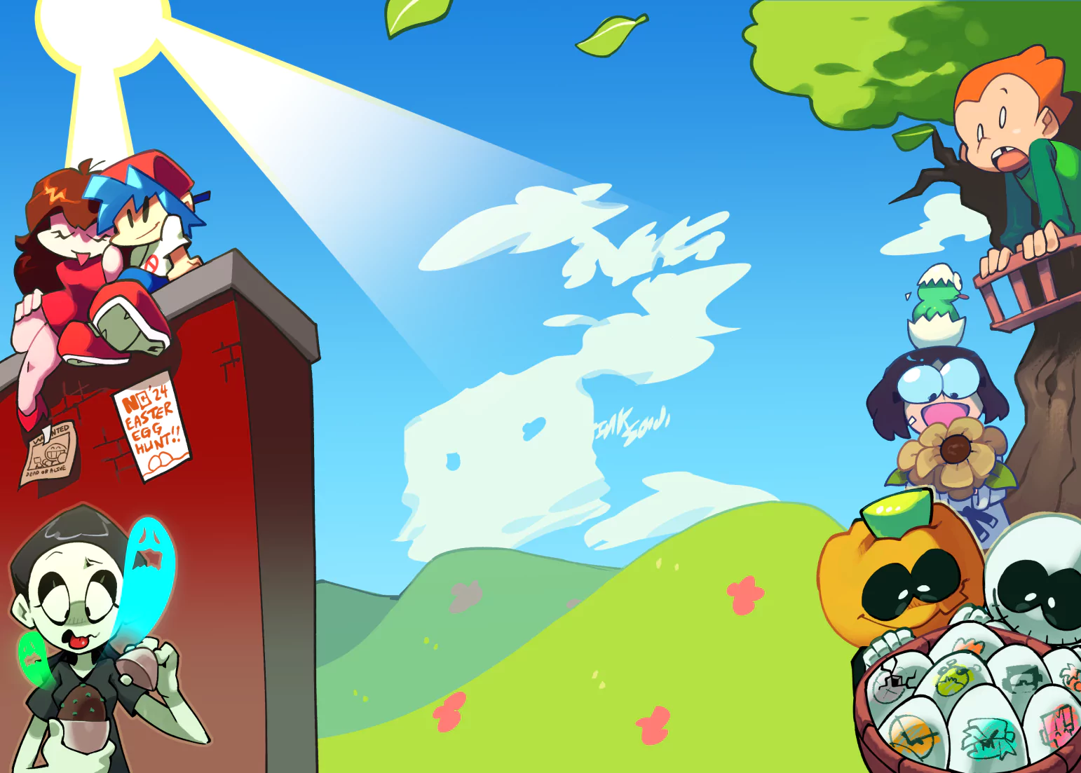
this art is great

Let 'Er Rip
ShareA brief and very self-indulgent character design study on Ripper Roo. I've always felt just his design alone speaks fucking volumes. He's so incredibly satisfying to look at and fun as hell to draw, so I wanted to dig in a bit and analyse what exactly is it that makes him work.
Charles Zembillas's original concept art particularly focuses on crooked and sharp shapes, something that the polygonal models of the original PlayStation games managed to use purely to its advantage. Ripper Roo's cutscene model in CTR nails his design pretty much perfectly.
I remember not thinking much when I first saw his N. Sane design 'cos he didn't look revoltingly disgusting like Papu Papu or the Komodos, so I just thought "oh, he looks okay, I guess." But as I kept looking at him, I came to the conclusion that Roo just looks too... safe.
There's no edge to his design, whatsoever. Methinks Roo is honestly one of the strongest examples of where the new realistic, soft and rounded fur textures are a massive disadvantage to the intended art style.
Agree 100%, the new HD Crash games completely killed the magic that made Crash special in the PS era.
Wow this puts words to my feelings about Roo's new design. Excellent character study.
its perfect
Love it
Credits & Info
- Views
- 1,658
- Faves:
- 52
- Votes
- 106
- Score
-
4.68 / 5.00
- Uploaded
- Jul 9, 2019
- 6:55 AM EDT
- Category
- Illustration
-
Frontpaged July 9, 2019
Licensing Terms
You are free to copy, distribute and transmit this work under the following conditions:
- Attribution:
- You must give credit to the artist.
- Noncommercial:
- You may not use this work for commercial purposes.


![[comission] ffxiv bard [comission] ffxiv bard](https://art.ngfiles.com/thumbnails/3861000/3861597.webp?f1713475318)


