00:00
00:00
Newgrounds Background Image Theme

NisoXD just joined the crew!

We need you on the team, too.

Support Newgrounds and get tons of perks for just $2.99!

Create a Free Account and then..

Become a Supporter!

Sharp Dressed Aberrants

Share

This is the Aberrants looking extra sharp. I drew this because I think it looks cool, and maybe to get some lady fans X3

For those of you who do not know, Aberrants consists of 4 people from different "studios" and have come together to create and combine each others ideas and things of that sort.

From right to left:
Scoot
Me
2K-Dragon
Dex

I do not plan on submitting many of my original characters yet. I want them to become known a little bit through manga/comics and animations before they are seen. So I plan on submitting draw of random characters, myself, or fan art.

It's better to look at this picture and listen to the song Sharp Dressed Man by ZZ Top

This was SOOOO many layers. However I am proud the way it came out. I worked very hard with this, and I think I am improving. It makes a kick-ass background for my desktop too X3

Who looks the best? X3 leave a comment

^_^ Here's a little game for you. Try and find the one item that isn't in this picture that they mention in the song.

Enjoy!

_________________________
_
Aberrants 2009
This was drawn by Son of SoH Studios (TM) 2009

Log in / sign up to vote & review!

Cool combo

So this was a nice and cool combo of characters here the poses of them all some very nice details with all the characters and great detail you have here with this one, so really nice work indeed on this art piece it was pretty nice work and I was very impressed with it all so really nice work here and I hope you make more beautiful art such as you have done so here.

~~SUGGESTED IDEAS~~
This was fine as is it is a beautiful art piece and there is no need for any changes.

~X~
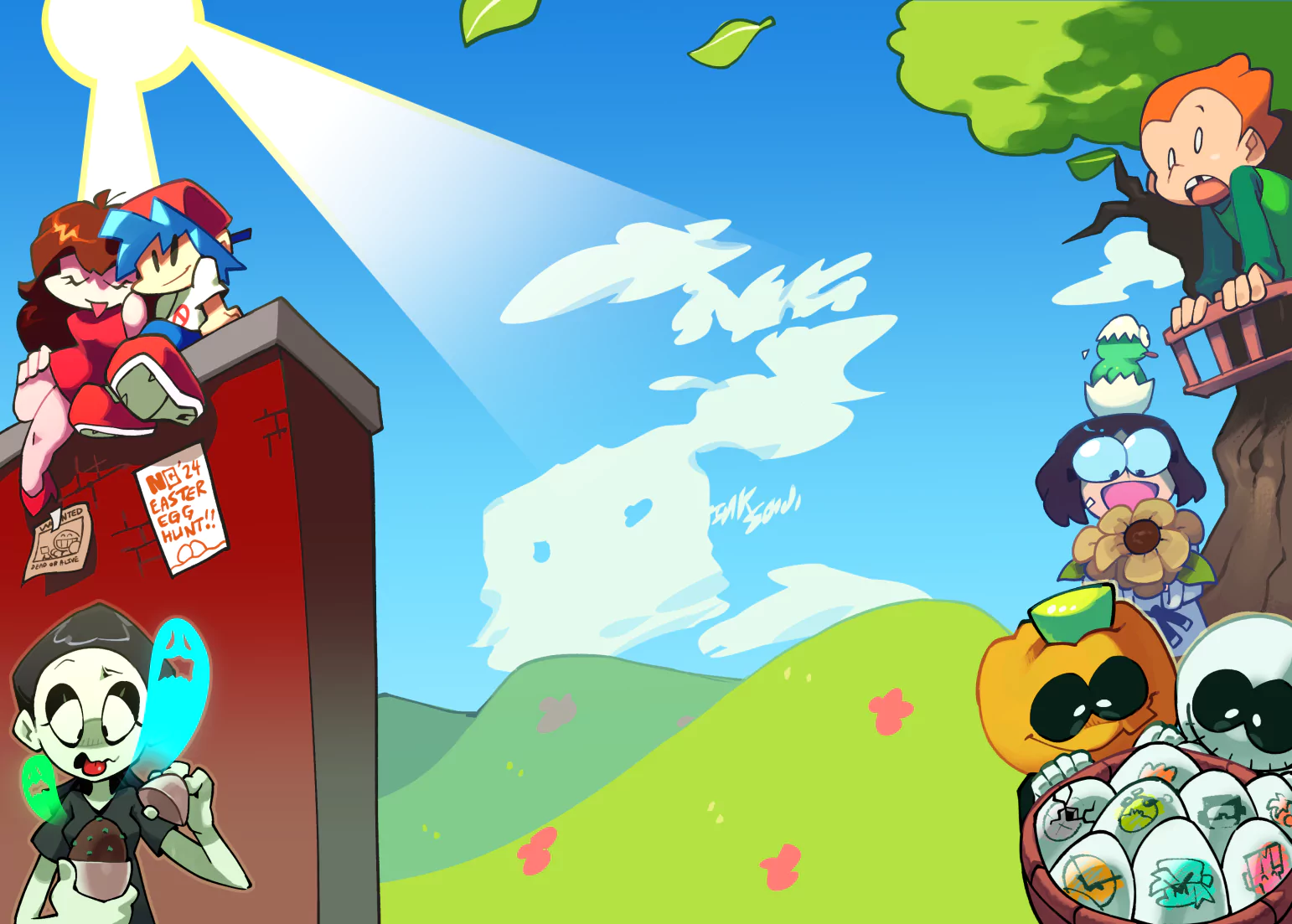
Sou's got manga skills yo

But too much color...it's a bit busy in the background...

You need to learn to direct your attention to the characters.

Ex: Forget that lazy effect in the background of zig-zags. And Make the petals less hard. They should be softer.

It'll help direct the attention to the characters.

Son23 responds:

I see what you're saying. I felt proud of this but I did kinda have that feeling I was either missing something or something was off. I took your advice and it does look better, and the characters stand out a bit.

Manga Studio 4, as far as I know, does not have any way to soften images. So I have lowered the opacity a bit. Since a lot of the picture is dark colors the petals still stand out.

Credits & Info

Artist
Views
2,705
Score
Waiting for 3 more votes

Uploaded
Jun 18, 2009
10:42 PM EDT
Category
Illustration

You might also enjoy...

Licensing Terms

You may not use this work for any purposes.