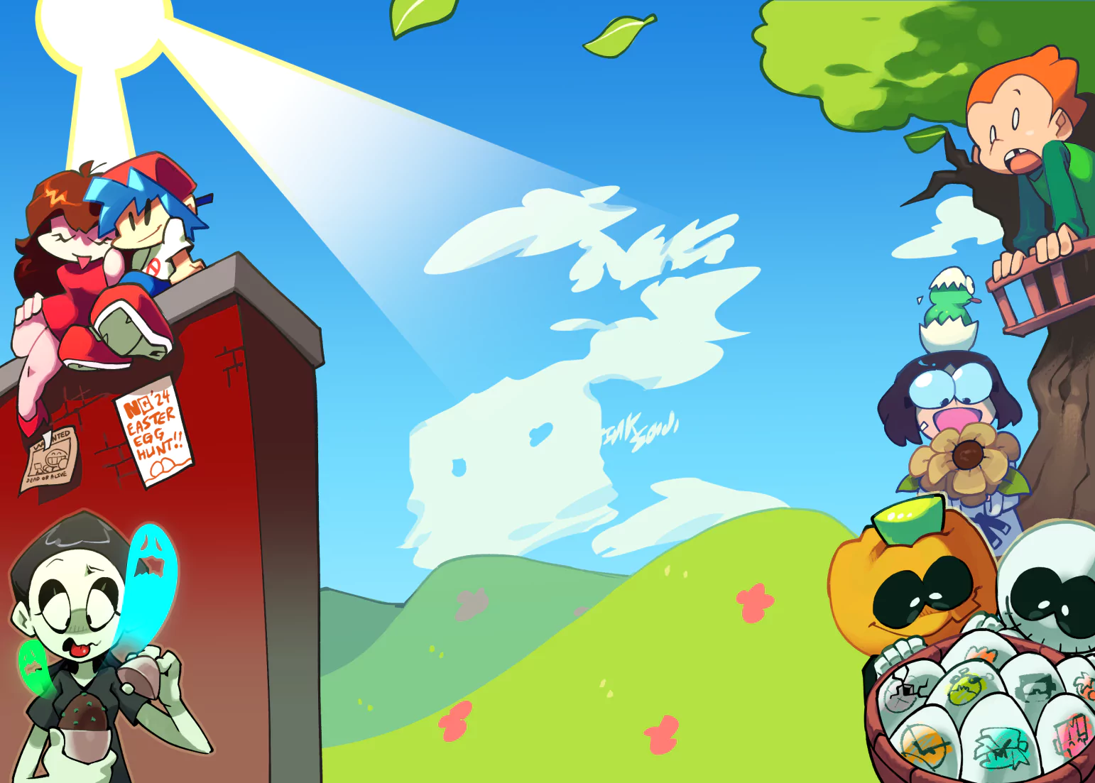
One of my favorite shows as a kid.

Zim
ShareNote that I don't want to be a jerk, I just don't find a lot to praise. Zim and GIR's models, while not bad, aren't quite that polished. There's also some colors I don't like like some of the green on Zim's skin. The white background doesn't do much - I feel some scenery should be added - Zim's lab, some top of a building. I am giving it a 2/5 that implies that you should try harder and hopefully you may make a solid Invader Zim drawing.
Pretty solid drawing here, great emotion in the eyes and face, the body could have a more dramatic line of action though and angling the head up more would benefit selling the pain he's feeling being zapped. Expanding on the line of action: right now it is very vertical when you break it down to the single line, shoot for diagonal lines - the more extreme the better. Vertical and horizontal are resting positions so they are very boring; even simply rotating zim clockwise a couple degrees will make the pose feel much more dynamic and intense.
This is pretty well rendered with a nice pallet on all the respective parts of zim, but they aren't doing much to sell him being zapped. The lightning is encompassing him so the highlights would surround him on all sides and get darker when going ink inward (when e look at it from the 2D plane anyway). I think your highlights could be more intense and maybe tinged blue on Zim instead of yellow. All in all I do like the colors you've chosen, they just don't agree so we'll with the lighting.
Last point and this is huge. If you walk away from this review with nothing else take this with you: that background style has never and will never work. You're better off just leaving the background white than duplicating the image you drew and making it bigger, offset and transparent. Doing that looks and is lazy and anybody with a developed sense of design and art will not like it. A better way to do that old be to take the silhouettes and make them a singly complimentary color and make it seem like a shadow or something, experiment with it.
WOW!!!! Thanks for all the pointers, I really appreciate you taking the time to give me some feed back!!!!
I agree with you a hundred percent, on the lines, its something that i need to work on. I also need to break out of the realistic mentality. What i mean by this is that i used to love taking a more realistic approach to drawing but became a bit bored with it since i get enough of that in real life :]. I enjoy a cartoon approach because you can break away nd do essentially anything [at least that's what i think]. However i am still struggling to be able to push those boundaries but still have the piece make since.
I struggled with the lightning because i didn't want to take away from the color, i didn't just want to put a blue solid color and then bring down the opacity because it looked like the brightness of the color went away. But i like your in put some bright blue highlights would have sold it and not taken away from the colors.
I will look into the silhouettes idea as well.
Again thanks for the input its much appreciated!!!
Credits & Info
- Views
- 1,084
- Faves:
- 6
- Votes
- 16
- Score
-
3.94 / 5.00
- Uploaded
- May 5, 2016
- 8:58 PM EDT
- Category
- Illustration
Licensing Terms
You are free to copy, distribute and transmit this work under the following conditions:
- Attribution:
- You must give credit to the artist.
- Noncommercial:
- You may not use this work for commercial purposes.
- No Derivative Works:
- You may not alter, transform, or build upon this work.


