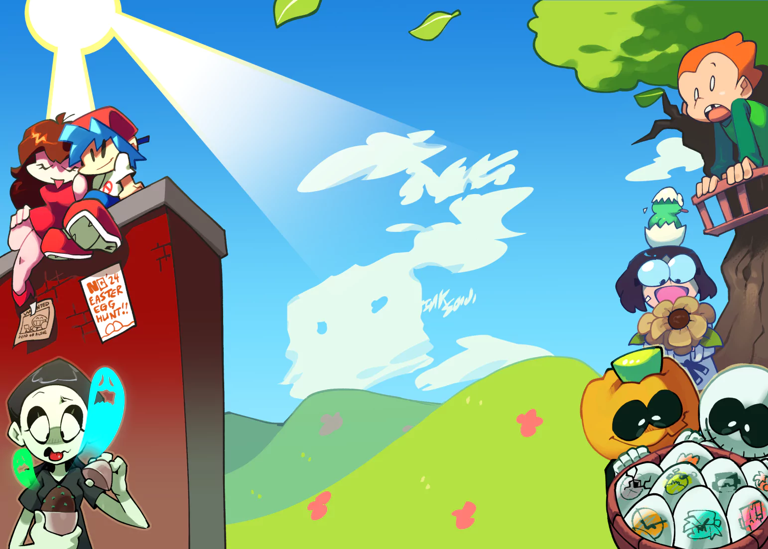
Nice piece, but the bottom half almost feels rushed and it makes it stick out a bit too much for my liking.
When you look at the top image, you see light play and depth with great detail, and it's done very well. However, as you start looking down, it is immediately and jarringly cut straight across, and seems to go into a different art style all together. There's no depth or light source, and the straight cut across the middle of the picture (especially with the tree roots extending past it) really serves to contrast the two styles.
I get that you did have to use several mediums to create this (meaning that some conflict of styles will always be present in some way), but there's ways to use that to your advantage. For example, put a bold hand-drawn piece next to a faded cut out from a photograph to create juxtaposition, while still leaving huge pieces of background to make it 'work'. This method simply jumbles the 2 mediums together, while the roots feel like they're trying to create some continuity between them and it doesn't work.
Another thing is the font. This is sort of an obvious point (that I'm sure you would have worked on if were worried enough about it), but standard fonts tend to stick out a little bit in art. This is especially true when they're formatted in such a way that puts so many similar characters together (h, l, n, m, i). Creating lettering really isn't that hard, and I highly suggest you try it.
All in all, every piece in this is fine enough on its own, however, I think it's the fusion of them that needs a little work.


